-
Courses

Courses
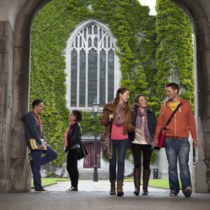
Choosing a course is one of the most important decisions you'll ever make! View our courses and see what our students and lecturers have to say about the courses you are interested in at the links below.
-
University Life

University Life
Each year more than 4,000 choose University of Galway as their University of choice. Find out what life at University of Galway is all about here.
-
About University of Galway

About University of Galway
Since 1845, University of Galway has been sharing the highest quality teaching and research with Ireland and the world. Find out what makes our University so special – from our distinguished history to the latest news and campus developments.
-
Colleges & Schools

Colleges & Schools
University of Galway has earned international recognition as a research-led university with a commitment to top quality teaching across a range of key areas of expertise.
-
Research & Innovation

Research & Innovation
University of Galway’s vibrant research community take on some of the most pressing challenges of our times.
-
Business & Industry

Guiding Breakthrough Research at University of Galway
We explore and facilitate commercial opportunities for the research community at University of Galway, as well as facilitating industry partnership.
-
Alumni & Friends

Alumni & Friends
There are 128,000 University of Galway alumni worldwide. Stay connected to your alumni community! Join our social networks and update your details online.
-
Community Engagement

Community Engagement
At University of Galway, we believe that the best learning takes place when you apply what you learn in a real world context. That's why many of our courses include work placements or community projects.
Foreground Images
Foreground Image Variations

Above is an example of a foreground image - this one is an animated gif, which loops only once.
You need to fully comply with copyright law. Ensure that you have the right to use any images you upload or insert onto your webpage. Further information is available on our Images FAQ page - Where can I find Images to use on my website.
Foreground images can be added to a page, ensure the image you wish to use has been made Web Ready, is saved in the Media Library as a Foreground image. Using the WYSIWYG Editor:
- Click on the Add an image or link to a file in the Media Library icon on the WYSIWYG ribbon.
 ,
,
or alternatively,
Click on the Insert tab and choose Insert file link or image - The Select media popup will appear.
- Go to your own Media category where the image is stored in the Media Library.
- Click on the Actions button for the image you wish to use.
- Choose Select media from the dropdown menu to select the image.
Full-Width Images
There is no point in adding an image that is bigger than the maximum available width on the screen.
If you do, the site visitor will experience a slower page load time than necessary - this impacts negatively on your page's google rankings.
And the browser will resize the image to fit (which it's not very good at), making the image blurry.
So before you upload your image, you should resize your images. The max size depends on the type of page you'll be putting the image onto:
Maximum Foreground Image Widths:
Normal page (left-nav, no rightbar): 735px
Normal page (left-nav & rightbar): 450px
Widescreen: 990px
Ultra-wide: 1386px
See how to resize an image here: Image FAQs. Or else watch videos on How it works and How we do it.
Smaller Images
 When you add a foreground image to a page, The bottom of the image is aligned with the botttom of the text. As you can see here, the image changes its line's height so it introduces a lot of white-space to your page.
You can change the behaviour of your foreground images after you add them to a page. Simply select your foreground image (you might have to drag it a little and bring it back to its original place to do this). You'll know it is selected when it goes slightly blue. Then double click it to see its properties. In the properties popup, you can set the class to left or right and optionally adding border, roundel, or polaroid for extra effects. Here are examples of all of these options:
Left / Right
 If you change a foreground image's class to 'Left', it will be left-justified, and the page's text wrap around it from the top of the image. The text will come close to it but will never touch it.
 You can also right-justify an image. Note, the size (width) of the image is unaffected when you do this.
Any images you plan to float left / right should ideally be 200px wide.
Notice how the right image is a little lower. That's because I typed a paragraph and pressed <Enter> (to start a new paragraph) before I added the second image. It's right-justified but the top of the image will be where the caret (the flashing vertical line that signifies where the next letter will appear) was when the image was inserted.
Border
 Adding the class border will give
  the foreground image a thin border. This is demonstrated using the same 2 images as above.
Tip: if you want 2 images to appear on the same line, like this, make sure there are some words between the 2 images - otherwise SM will treat them as the same image (applying the same class to both).
Roundel
 Using the class roundel is a popular effect for foreground images which adds a border and makes square images round (or makes letterbox images oval). It has a wide margin of white-space between it and adjacent text an displays the image's description (from the media library) below the image.
Roundel images are auto-resized to 200px wide. But browsers are not good at resizing images so you should upload a 200px-wide version of your image to the media library. This ensures the image will look good on all browsers and will load quickly (which helps your google rankings). For best results, use an image that is 200px x 200px, with the subject centered in the image.
By default, roundel images are right-justified but you can use the class roundel left to change this.
Polaroid

The polaroid class can be applied to images on your page. Simply select your foreground image (you might have to drag it a little and bring it back to its original place to do this). Then double click it to see its properties. In the properties popup, you can set the class to polaroid right to style it as a polaroid photo and show its description (from the media library) underneath.
Polaroid images that appear on the left or right of the page will be resized to 200px wide by the browser but that's not an excuse to avoid preparing images - you should use images that you've already sized to this width so that the pages loads quickly and performs well in Google rankings.
Use polaroid left to make it appear on the left, resized to 200px wide.
If you set the class to polaroid only (and leave out left or right), it'll behave like you said 'polaroid left'. However, the image will not be resized.
If your foreground image has no description (in the media library), no text will appear under the polaroid image. This is not a good thing - the description needs to be there to ensure accessibility for visually-impaired users. If you want to have no text appearing, use the keyword border instead.
