-
Courses

Courses
Choosing a course is one of the most important decisions you'll ever make! View our courses and see what our students and lecturers have to say about the courses you are interested in at the links below.
-
University Life

University Life
Each year more than 4,000 choose University of Galway as their University of choice. Find out what life at University of Galway is all about here.
-
About University of Galway

About University of Galway
Since 1845, University of Galway has been sharing the highest quality teaching and research with Ireland and the world. Find out what makes our University so special – from our distinguished history to the latest news and campus developments.
-
Colleges & Schools

Colleges & Schools
University of Galway has earned international recognition as a research-led university with a commitment to top quality teaching across a range of key areas of expertise.
-
Research & Innovation

Research & Innovation
University of Galway’s vibrant research community take on some of the most pressing challenges of our times.
-
Business & Industry

Guiding Breakthrough Research at University of Galway
We explore and facilitate commercial opportunities for the research community at University of Galway, as well as facilitating industry partnership.
-
Alumni & Friends

Alumni & Friends
There are 128,000 University of Galway alumni worldwide. Stay connected to your alumni community! Join our social networks and update your details online.
-
Community Engagement

Community Engagement
At University of Galway, we believe that the best learning takes place when you apply what you learn in a real world context. That's why many of our courses include work placements or community projects.


Creating Accessible Documents
The European Union (Accessibility of Websites and Mobile Applications of Public Sector Bodies) Regulations 2020 came into force on 23 September 2020. Public sector bodies in Ireland must ensure their websites and mobile applications are accessible to everybody, including people with disabilities. That includes Word & PDF documents hosted on our websites.
Fortunately, if you make your documents accessible:
- It's quick and easy to learn
- It benefits all users in making files easier to navigate and searchable
- Most importantly, it ensures that everyone has equal access to information and services.
Make your writing accessible
- Use plain English to increase readability.
- Keep sentences short; 15 to 20 words in each sentence.
- Avoid technical words, unfamiliar abbreviations or acronyms; also avoid French and Latin expressions.
- Spell out acronyms the first time you use them, for example, Association of Higher Education Access and Disability (AHEAD).
- Be consistent with terms throughout your document.
- Proofread your document to ensure correct spelling and punctuation.
Formatting and layout
- Use clear and accessible formatting to make information easy to find. For example, use headings, logical sub-headings and a table of contents.
- Use a consistent layout for recurring features (such as page numbers and headings).
- Make good use of white space so your message stands out.
- Use clear spacing:
- Text should be a minimum of single-spaced.
- White space should separate paragraphs.
- There should be a wide, clear space separating text columns.
Make the text easier to read
- Use at least 12-point font size and a clear, easy to read font.
- Use bold or bigger size font to make important points stand out.
- Use bold to make important points or instructions stand out.
- Avoid using features such as underlining and BLOCK CAPITALS.
- Use italics sparingly and avoid blocks of italicised text.
- Use left aligned text only, do not justify text.
- Avoid splitting a word between two lines.
Provide alternative text for images
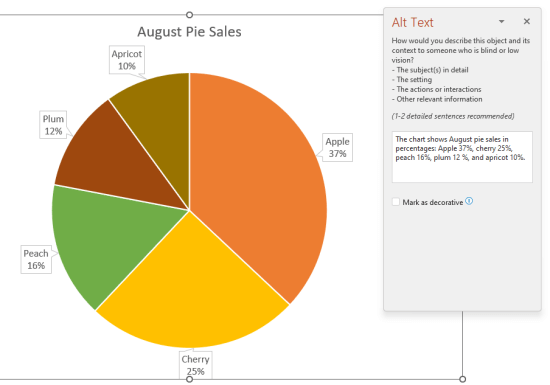
If your document contains an image or graph, you must provide alternative text to provide the same information for someone who cannot see it. To add alt text, follow the relevant instructions from Microsoft for your version of Windows/Mac and Office.
The alt text itself should describe the image with sufficient detail for a user with a visual disability to receive the same key information. For instance, describing a chart as 'A bar chart showing sales over time,' for example, would not be adequate for a user to answer a question that relies on interpreting the sales data. Instead, summarise the insight, e.g. 'A bar chart showing sales over time. In July, sales for brand A surpassed sales for brand B and kept increasing throughout the year.' and include data such as percentages, dates in the alt text or in an accompanying table. Alt text should also clearly describe the beginning point, progress, and conclusion of flow charts.
Microsoft have a short guide that you may find useful in writing alt text.
Pay attention to the colours you use
Colour blindness (colour vision deficiency, or CVD) affects approximately 1 in 12 men (8%) and 1 in 200 women in the world, with red/green colour blindness the most common. Thnk about the colours you use in your document, particularly in graphs or diagrams. Is colour the main way to convey the information in a graph, for instance? Imagine if colour was removed entirely - would the information be lost? Consider using a colour blindness simulator to get an idea as to which colours and combinations should be avoided (e.g. red/green, green/brown, green/blue, blue/gray).
Instead, use geometrical shapes, line patterns, fill textures or even labels in your graphs. This will improve readability for everyone. Consult Microsoft's guide on shape fill, outline, or effects for assistance.
Use Microsoft Office's built-in Accessibility Checker
The Accessibility Checker can be found under the Review tab: click 'Check Accessibility' to open the Accessibility pane on the right. It will flag a list of errors and warnings, with how-to-fix recommendations for each.
Please note though that it's not 100% comprehensive. For instance, if you were to manually create 'headings' that were in fact just larger text, in bold, the Accessibility Checker would not recognise that you intended to create headings. Consquently, a screen reader would not detect or benefit from these pseudo-headings, which serve no useful function.
Create meaningful links
When writing, it's tempting to either paste in the full address - https://www.universityofgalway.ie - or some variation on 'click here'. That format is not useful to a reader though, particularly with long URLs where the end destination is difficult to discern, or the blank signpost of a 'read more'. There is excellent guidance on creating short, meaningful links at WebAIM, a fantastic resource on web accessibility, which applies equally to using links in documents.
Make your tables accessible
There are a few easy steps you can take to make tables more accessible. Staff or students without any difficulty with their sight can visually scan a table, and quickly make visual associations between data in the table and their appropriate row and/or column headers. For users who rely on assistive technology, it can be more difficult to intrepret the data if certain formatting steps are not followed correctly.
- Give your data table a Title (right-click on the table and select Table Properties > Alt Text > Title)
- In Table Properties > Row, ensure 'Repeat as header row at the top of each page' is ticked and 'Allow row to break across pages' is unticked.
- Designate your table headers correctly. You should abe able to access these tickboxes under then 'Table Design' tab (note that this table on appears in Microsoft Word when the table is selected)
- Data tables must have only one header row and/or one header column
- Make you tables as simple as possible. They should have no nested, merged or split cells.
- Do not use the Draw Table tool to create the table - use Insert > Table instead.
- Never display data using spaces instead of a table object.


